NIDO
- Year
- 2026
- Type
- Work project · Tres Astronautas
- Stack
- Nest.js
- PostgreSQL and Prisma ORM
- MongoDB
- Socket.IO
- Next.js
- React
- Expo and React Native
- Tailwind CSS and NativeWind
- Google Cloud Run
- Firebase Hosting
- Turborepo
Summary
NIDO is a condominium management platform that brings the daily life of a residential building into one product: notices, visitors, common areas, events, chat, fees and local commerce.
It replaces the group chats, paper notices, gate logbooks and phone calls that a condominium usually runs on. Administrators publish and manage from one place, guards control who comes in, residents handle their everyday matters from their phone, and every important action leaves a record.
NIDO works as a network rather than a single building. A platform team manages many condominiums from one place, and each condominium has its own administration, residents and gate staff. Around them, local businesses join in two ways: partners, such as restaurants, gyms or shops, offer benefits and coupons to residents, and providers, such as water, bakery or pharmacy deliveries, sell through an in-app catalog and handle orders.
The product is made of three apps on one platform:
- A web portal that behaves like five portals, one for each role that signs in: the NIDO platform team, condominium administrators, guards, partners and providers.
- A staff app on a tablet, for the gate team: visitors, arrivals, pre-registrations, pass checks and access history.
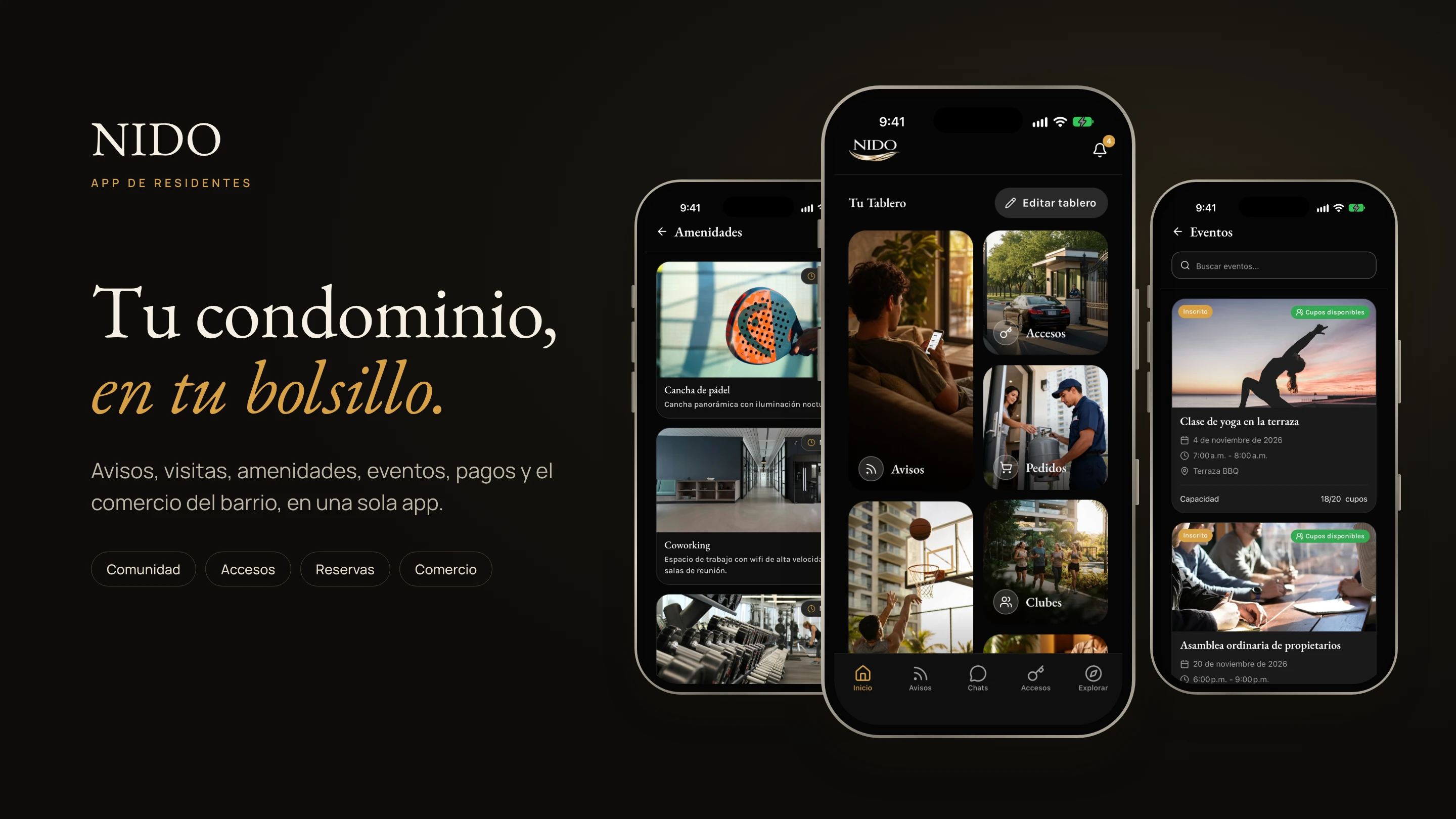
- A resident app on the phone, the only way residents use NIDO.
Not every condominium needs every function. The NIDO team turns modules such as amenities, payments, orders, the neighbor marketplace or the service directory on or off for each condominium, and the apps adapt right away. Notices, access, events, clubs and chat are always available. Everything works in Spanish and English, with light and dark themes.
I worked on NIDO at Tres Astronautas for a client, as a Senior Software Engineer, in a team of five over five months. I built the resident app and the staff app, and a large part of the web portal.
- 13
- capabilities
- 6
- user roles
- 3
- apps: web portal, staff tablet and resident phone
Context & role
- Client: A condominium management company. The name is kept private.
- Company: Tres Astronautas
- Product: Web portal, staff tablet app and resident phone app on one platform
- My role: Senior Software Engineer
- Team: 1 product owner, 2 software engineers, 1 product designer and 1 QA
- What I built: The resident app, the staff app and a large part of the web portal
- Duration: 5 months
Problem
Before NIDO, a condominium ran on scattered channels. Notices went out through group chats and paper on the wall, the gate kept a logbook by hand, common areas were booked by phone, fee receipts arrived as screenshots and local services spread by word of mouth.
That cost something to everyone involved:
- Administrators spent their day answering the same questions and chasing payments, with no single picture of the condominium.
- Guards wrote down every visit by hand while someone waited at the gate, and had to call the resident to confirm.
- Residents missed notices buried in chats and could not see whether a space was free without asking.
- Local businesses had no direct, trusted way to reach the people living in the building.
And nothing left a reliable record. When something went wrong, nobody could say who let a person in, who approved a payment or who changed a booking.
Users & context of use
Six roles use NIDO, plus visitors, who have no account. Each one uses the product in a very different situation, and those situations shaped the design more than the list of features did.
Resident
Gets notices, authorizes visitors, reserves common areas, joins events, chats with neighbors, pays fees and buys from local providers.
Mobile app
Visitor
Has no account. Completes the pre-registration link a resident shares, then checks in with the guard at the gate.
Web page from a link, no install
Guard
Registers arrivals and walk-ins, scans pass QR codes, checks pre-registrations and keeps the access history of the condominium.
Staff app, or web portal if the condominium allows it
Condominium administrator
Manages residents, units, guards, amenities and reservations, fees, announcements, events, vendors and access, and moderates chats.
Web portal, condominium area
Platform administrator
Creates and manages condominiums, global announcements and events, merchants and deals, providers and orders, the resource hub and the audit log.
Web portal, platform area
Partner
A business that publishes offers and coupons for residents, registers redemptions and follows its metrics.
Web portal, partner area
Provider
A local business that keeps a catalog, with CSV upload, and handles resident orders from acceptance to delivery and payment confirmation.
Web portal, provider area
The moments that shaped the design
- The guard at the gate works standing up, with a visitor waiting and often a car behind. Every extra field or tap is felt, so the staff app needed large targets and very short forms.
- The administrator opens the portal to answer one question: what needs my attention today? The first screen had to answer it without digging.
- The resident opens the app for something specific and leaves. The things they use most had to be one tap away, and they differ from one person to the next.
- The visitor should not have to install anything. A link and a short web form had to be enough.
Goals, success metrics & constraints
Goals
- Replace the scattered channels with one place for each role.
- Make access to the condominium faster at the gate and traceable afterwards.
- Let residents solve everyday matters, such as bookings, visits and payments, without calling the administration.
- Give local businesses a direct and trusted channel to residents.
How success would be measured
No success metrics were agreed with the client during the project. These are the ones I would propose to know whether NIDO is meeting its goals, each tied to one of them:
| Goal | Metric | What it tells us |
|---|---|---|
| One place for each role | Share of units with at least one active resident, and weekly active residents per condominium | Whether residents actually moved from group chats and paper notices to the app. |
| Faster, traceable access | Median time to register an arrival at the gate, and share of visits that arrive pre-registered or with a pass | Whether the gate got faster, and how much of the work residents now do ahead of time. |
| Self-service for residents | Share of reservations and visit approvals completed in the app without the administration stepping in | Whether everyday matters stopped going through phone calls to the administration. |
| On-time payments | Share of fees paid by their due date, and time to validate a receipt | Whether collecting fees became easier for both sides. |
| A channel for local businesses | Coupon redemptions and provider orders per condominium each month, and how fast providers respond | Whether partners and providers get real value from the platform. |
The first measurement would set the baseline, compared where possible with how each condominium worked before NIDO.
Constraints
- Six roles with very different needs, sharing one platform and many condominiums, each with its own data.
- Personal data of residents and visitors had to stay protected, and every sensitive action had to be traceable.
- Two languages and light and dark themes from the start.
- Payments had to work before a payment gateway was ready.
- Shared capacity. The team started on NIDO full time. Partway through, the company also needed us on another project, so part of the build was delivered while working on both at once. That made prioritization stricter: the flows each role uses every day came first, and the rest was planned in steps.
Process & prioritization
From problem to scope
The work started from the roles and their moments, not from screens. For each role, the team mapped the jobs they repeat every day, the flows that cross from one role to another, such as a visit that starts with a resident and ends with a guard, and the information each step needs.
That map turned into the product's modules, and into a first version focused on what a condominium needs every day: notices, visitors and access, common areas, fees and the resident app.
How the team worked
Every week we met with design and with product to review progress, and once a week we also met with the client to validate progress and scope and to collect their feedback. Those two loops kept design, product and engineering aligned, and let the client see the product grow and adjust priorities along the way, which mattered even more once the team was sharing its time with another project.
What the platform covers
| Area | What it enables |
|---|---|
| Announcements | Notices from the administration, urgent announcements and an AI writing assistant for administrators. |
| Visitors and access | Pre-registration of visitors, guest passes, a visitor blocklist, guard access and access history. |
| Reservations | Common areas with reservations, invitations and guest passes. |
| Events and clubs | Events residents can sign up for, plus clubs with moderation. |
| Chat | Real-time conversations between neighbors, with private messages, a profanity filter and a retention policy. |
| Fees and payments | Charges per unit with an overdue sweep, receipt-based payment validated by an admin, and a payment gateway integration being wired in step by step. |
| Marketplace | Local providers, a catalog, orders, offers and deals, and partner benefits. |
| Administration | Condominiums, units, residents, guards, vendors, legal documents, settings and a platform admin area. |
| Premium and metrics | Premium plans and metrics for the platform. |
| Notifications | Push notifications, email and SMS. |
| Account safety | Device one-time codes, account deletion with verification and versioned terms acceptance. |
What waited and what was discarded
- The online payment gateway waited. Fees started with a receipt-based flow, so the condominium could collect from day one while the gateway is integrated step by step.
- Granular roles and permissions were discarded. The idea was to let the NIDO platform team and each condominium administrator create their own roles and choose, permission by permission, what each one could do within their scope. It did not fit in the time available and was not part of the roadmap, so the product kept six fixed roles with clear, predefined permissions. The fixed roles cover what each condominium needs today, and granular permissions remain an option if the network grows into it.
Design decisions
The decisions that most shaped the experience, made by the team and designed by the product designer of the project. Each one starts from a real situation, explains what was chosen and what it cost. Click any image to open it larger. The screens are in Spanish, the language of the users.
One portal, one area per role
Problem. Five roles work from the web, and each one needs very different tools. Showing everything to everyone would make every screen harder to use.
Decision. One portal with a separate area per role. The menu, the home screen and the available actions change with the person who signs in.
Trade-off. Shared pieces, such as notices or access, had to be designed once and adapted to several roles.
In the product. After signing in, each person lands directly in their own area, and the menu and the screens they can open depend on their role. Shared modules, such as notices and access, are built once and show each role only the actions that belong to it.
A first screen that answers one question
Problem. Administrators opened the portal to find out what needed their attention, and that information lived in different modules.
Decision. The home screen summarizes money, people, access and common areas, with shortcuts to act on each one.
Trade-off. It only shows a summary, so the detail is always one step away.
In the product. Each summary card is also a shortcut: one click takes the administrator from the number to the list behind it, already filtered.
The gate on a tablet, with a short form
Problem. Guards register visits standing up, with someone waiting. A desktop portal or a phone screen made that slow.
Decision. A separate tablet app for the gate team, in landscape or portrait, where only the unit and the type of access are required and everything else is optional.
Trade-off. One more app to design, build and maintain, and less data captured on each visit.
In the product. I built the staff app so every screen works in landscape and portrait, with large touch targets and a form that only blocks on the two required fields. The visitor photo is taken with the tablet camera, right from the form.
Personal data hidden by default
Problem. Guards and administrators see personal data of many people every day, and most of the time they do not need it.
Decision. Documents and other sensitive data appear masked, and revealing them is a deliberate action that is recorded.
Trade-off. One more tap when the data is really needed.
In the product. Screens receive personal data already masked, so it is hidden everywhere by default, not just on one screen. Revealing it is a separate, deliberate action, and that action is recorded too.
Approval only when it is needed
Problem. Calling the resident for every visit slowed down the gate, but letting anyone in was not acceptable.
Decision. A visitor who comes alone with a valid pass goes in, and the resident is only notified. A visitor with companions or without pre-registration needs approval, and whoever decides first, the resident or the guard, closes the request.
Trade-off. The rules are harder to explain than "always ask", so the app has to make each case clear.
In the product. The request reaches the resident's phone right away, and both the resident and the guard see it update live, so whoever answers first closes it and the other one sees the result without refreshing.
A home screen the resident arranges
Problem. Every resident uses the app for different things. A fixed menu would bury what each person needs most.
Decision. The home screen is a board of large shortcuts that each resident adds, removes and reorders.
Trade-off. A personalized screen is harder to explain in support and to show in onboarding.
In the product. I built the home screen as a grid of shortcuts with an edit mode to add, remove and reorder them, and the layout is saved for each resident. Shortcuts for modules the condominium has turned off simply do not appear.
Receipt-based payments first
Problem. Condominiums needed to collect fees right away, and the online payment gateway was not ready.
Decision. Recurring charges per unit, with a receipt the resident uploads and the administration validates, while the gateway is integrated step by step.
Trade-off. Administrators review receipts by hand for now.
In the product. Residents see their invoices, upload the receipt from their phone and follow its status until the administration validates it, so the flow is ready to switch to online payments when the gateway arrives.
Design system
The web portal, the staff app and the resident app are built on one design system, created by the product designer assigned to NIDO at Tres Astronautas. A person who moves from one app to another, such as an administrator who also lives in the building, recognizes every piece.
Foundations
- Two typefaces with clear roles. EB Garamond, a classic serif, for titles, which gives the product a calm, residential tone. Karla, a clear sans serif, for the interface, forms and data.
- A type scale shared by web and mobile. Headlines, body text, labels and buttons have the same sizes and line heights on every screen.
- A gold brand color used with intent. Gold marks the main action of each screen and the active state. A darker gold is used for focus rings, so they keep enough contrast against white.
- Two neutral scales. One for the light theme and one for the dark theme, with matching steps, so every surface, text and border has an equivalent in both.
- Status colors with fixed meanings. Success, error, warning, info and purple always mean the same thing, for example in order, payment or visit states.
- Radius and spacing scales. A short set of values that keeps cards, inputs and buttons consistent.
Components in both themes
The component library follows atomic design in the three apps. Primitives, such as buttons, inputs, tabs and switches, combine into atoms, such as status badges and filter chips. These build molecules, such as list rows, cards and forms, and then organisms, such as lists, calendars and dashboards.
Light and dark themes were a rule from the start, not a later addition. Every component, from a button to a loading skeleton, had to work in both, using only the tokens of the system, never one-off colors. Residents can follow the theme of their phone or choose one, and the app remembers it from the first frame it shows.
One language on three screens
The same tokens and patterns appear on the laptop, the tablet and the phone. A reservation, a visit or a payment looks the same wherever it is seen, which makes moving between apps, and supporting them, simpler.
Built into the apps
I brought the design system into code in the resident app and the staff app. The colors, typography, radius and spacing became shared theme tokens with a light and a dark version, and the components were built as a library following the same atomic layers as the design, from primitives to full screens. That way a new screen is assembled from existing pieces, and a change to a token reaches every screen that uses it, in both themes.
From design to code
As a Senior Software Engineer, my work was turning the design into a working product. Many technical choices exist only to protect the experience the design called for. This section explains how the platform is organized, in terms of what each part does.
Architecture
The platform lives in one repository: the API, the web portal, the resident app, the staff app and shared packages. The API is split into business modules, such as condominiums, access, amenities, fees and the marketplace, and each module keeps its business rules apart from the technical details, so features can grow without getting tangled. Click a diagram to open it at full size.
Platform data, such as condominiums, units, people and payments, is kept apart from chat conversations, which have their own store. Real-time chat runs alongside the rest of the API. The web portal is available in Spanish and English, and both mobile apps share the same design language.
Private, real-time chat
Neighbors can talk to each other in real time from the resident app. Before a message is sent, offensive words are filtered out, and once it arrives it is stored privately, so it is never kept as readable text. Conversations follow a retention policy, and condominium administrators can moderate the conversations of their community.
Mobile connections are not always stable, so the chat was built to recover on its own. If the connection drops because of a weak signal or a long idle time, the app notices, reconnects without the resident doing anything, and shows any messages that arrived in the meantime.
Accounts and audit
Sessions expire on their own and renew quietly while a person is active, and signing in from a new device asks for a one-time code. Each role can only reach the actions that belong to it.
Every sensitive action leaves a record: who did it, with what role, in which condominium and when. Revealing personal data, such as a visitor's document, is recorded too. Automated checks look for exposed credentials before any change is shared.
Visitors and access
A resident shares a link tied to their unit, valid for 24 hours. The visitor fills in a web form with no install, and the link is consumed. At the gate, a visitor who comes alone with a valid pass is checked in and the resident is only notified. A visitor with companions, or one with no pre-registration, needs approval: the resident gets a request, and whoever decides first, the resident or the guard, closes it.
Marketplace orders
Orders to local providers follow a fixed set of states. The provider accepts or rejects, the resident can cancel until two hours before the slot, and payment is on delivery, confirmed by the provider. A payment problem closes the order with an incident.
Web, staff and mobile
Three clients share one API. The resident app has five tabs, and its Explore tab shows only the modules that the condominium has enabled. The staff app is a second app for guards, with the same sign-in but open only to them. It lists visitors, shows the access history and checks visitor passes with the camera. The web portal has one area per role: condominium admin, platform admin, partner, provider and guard when the condominium allows it. A few public pages, such as visitor pre-registration and password setup, open from a link with no account.
Delivery
The platform has separate development, staging and production environments, and each release is promoted on purpose. The web portal and the two mobile apps ship on their own schedules. Every change runs tests and automated quality and security checks before it is merged.
My part of the build was the client side of the platform: I built the resident app and the staff app, and a large part of the web portal, on top of the shared API.
Working with AI agents
The repository includes a small harness for sessions of people and AI agents on one checkout: a registry of sessions with path claims, locks for shared resources, a leader agent that splits work, implementer and reviewer agents that write reports to disk, and written end-state criteria. People own git, and agents never commit.
Technical decisions
These are the technical choices that shaped the platform, with the reason for each and what it cost.
| Decision | Why | Trade-off |
|---|---|---|
| Business modules with clear boundaries | Business rules stay apart from technical details. | More files per module. |
| Separate stores for platform data and chat | Each kind of data lives where it fits best. | Two stores to run and back up. |
| Private chat by design | Messages stay private, even inside the platform's own data. | Extra work to protect older messages. |
| A single audit log table | One place to answer who did what. | Every mutation must remember to write to it. |
| A static web export | Cheap, fast hosting with no server to run. | No server-side rendering for the portal. |
| Receipt-based payments first | Fees can be collected now while the gateway is integrated gradually. | An admin validates receipts by hand. |
| Tolerant CSV import | Header matching ignores case, spaces, hyphens and dots, and accepts synonyms. | Looser validation on import files. |
Results
The client received a complete condominium platform: a web portal for administrators, guards, partners and providers, a tablet app for the gate and a phone app for residents, in Spanish and English with light and dark themes.
- Administrators manage the community from one place, with a daily summary of what needs attention.
- Guards register arrivals from a tablet, and every access leaves a record.
- Residents handle visits, bookings, events, payments and local commerce from their phone.
- Partners and providers have their own space to reach the community.
One part is still being finished: fees work through receipts, and the online payment gateway is being integrated.
NIDO is an MVP that is about to launch in Panama, so there are no usage numbers yet. That is also why the metrics above matter: the first condominiums to adopt it will set the baseline, and from there we will know whether the gate got faster, whether residents stopped calling the administration for everyday matters and whether fees are paid on time. The launch is where the real feedback starts, and I expect it to change some of the priorities we set during the build.
Learnings & next steps
Next steps
- Launch with the first condominiums in Panama and take the first measurements as the baseline.
- Finish the online payment gateway, so residents can pay without uploading receipts.
- Measure the flows that matter most, such as registering a visit and booking a space, to improve them with real data.
What I learned
- The design system pays for itself early. Bringing the tokens and base components into code took time at the start, and for a few weeks it felt slower than just building screens. After that it was the opposite: new screens came together from pieces that already existed, and dark mode stopped being extra work. Next time I would start there even sooner.
- Leaving things out is also product work. Granular permissions were a good idea, and it was tempting to try to fit them in. Keeping six fixed roles made the product clearer for everyone and let us finish what each role needs every day. I learned to treat "not now" as a decision, not as something we failed to do.
- The context of use changes the code too. Building the staff app with a guard standing at the gate in mind changed small things everywhere: fewer required fields, larger touch targets, screens that work in both orientations. The best feedback in the weekly meetings came from thinking about where and how each person would actually use the app.
Final product
A few screens of the final product, with demo data.